🌈 Across the Wheel - Complementary Colors Revealed 🎨
🌈 A follow-up story that connects Line and Shape with the Chapter Color from the Art Album 🎨✨and invites children to explore how artists use opposites on the color wheel to bring life, light, and dimension into their work! From outlining the shape of an apple with bold, curved lines 🍎 to filling it in with the unexpected—like green shadows under a red skin—children uncover the secret of complementary colors. This story builds on earlier discoveries of primary and secondary colors, guiding young artists to understand how visual contrast and harmony can make their drawings more realistic.The story invites children to wonder: “Can two opposite colors become best friends in my artwork? Do I really start with purple if I want to draw a realistic banana? ”—and encourages them to experiment and create their own color wheel using watercolor, pastels, pencils or markers as a tool for their future artistic adventures. 🎨💭
ART STORIES
8/17/20252 min read
We’ve been talking about colors a lot before, haven’t we?
On our art shelf, we have many different media—colored pencils, watercolors, pastels, maybe even acrylics or markers. We can draw on sketch paper, thick art paper, or canvas. So many possibilities! But today, we’re going to do something that might surprise your artist’s brain. 😲
Take a look at this red apple. 🍎
Yes—it’s red. Shiny, juicy and delicious.
We won’t cut or label its parts today. We’re going to use it… for our art. But before we start drawing this apple…
Let’s go back a bit: Do you remember which were our Primary Colors?
🎨 Red, Yellow, and Blue. They’re the “first colors,” the ones we use to make all the others on our color wheel. And what about Secondary Colors?
🟠 Orange (from red + yellow)
💚 Green (from blue + yellow)
🟣 Purple (from red + blue)
Wonderful! You’re already thinking like an artist. 🧑🎨
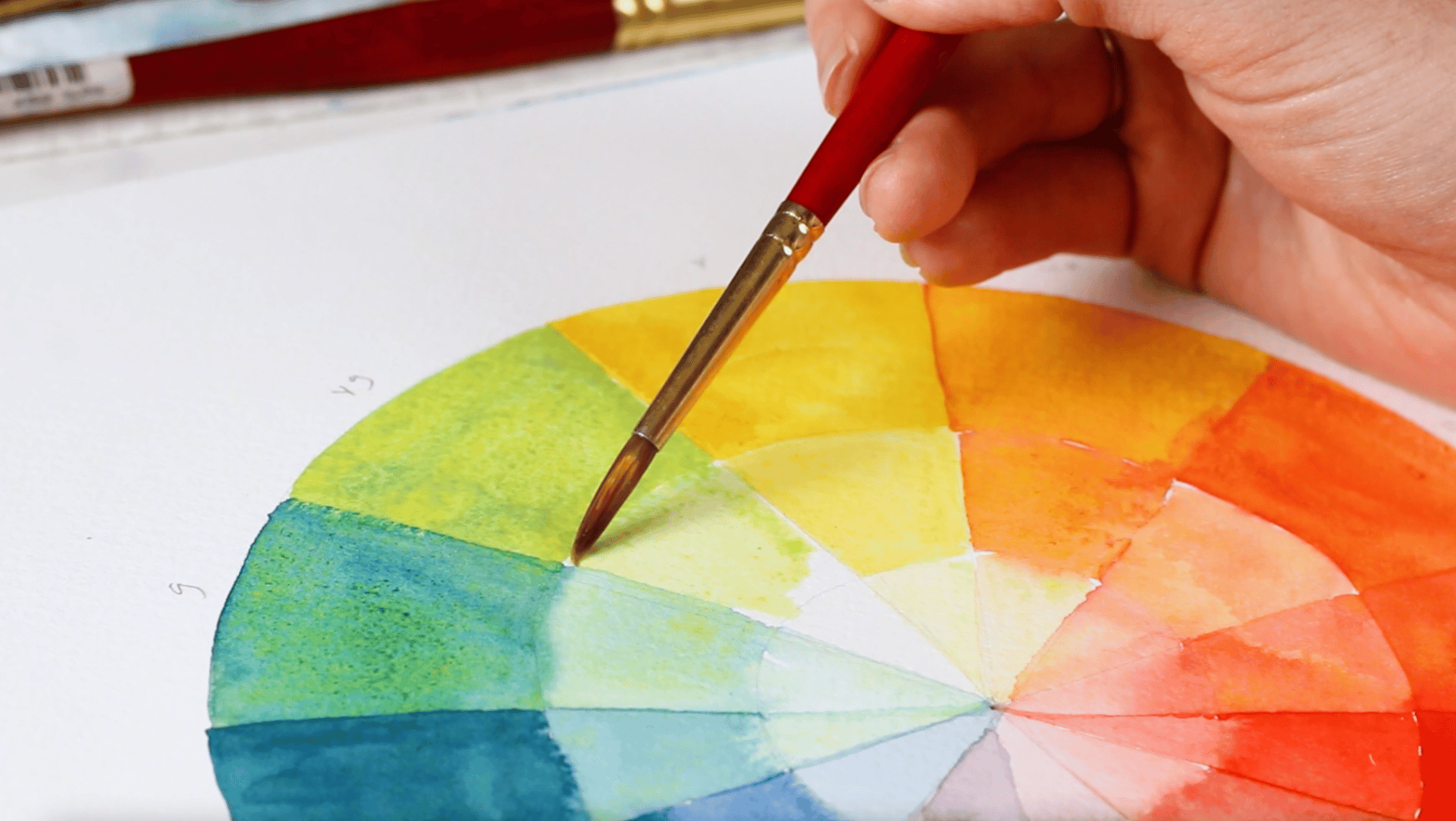
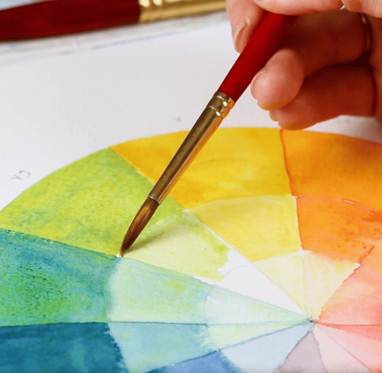
Now… look at this Color Wheel I brought. (📍Display it.)
It’s like a secret map of relationships between colors. Have you ever noticed that every color has an opposite?
Colors that sit across from each other on the wheel are called… 👉 Complementary Colors!
Red and Green
Blue and Orange
Yellow and Purple
Wait a minute… Red and green? Like all the Christmas decorations. Yes! These two colors are opposites, but guess what? They actually work beautifully together. In fact, we can find complementary color pairs in nature— leaves , flowers, and amphibians even some birds. 🎨 Today, we’re going to try an artist’s experiment with this idea!Let’s start by drawing the outline of our apple with a pencil.
Now here comes the surprise… we’re going to color it with green!
“But wait… isn’t our apple red?” 🍎 Exactly. And if you want your red apple to look more real—more three-dimensional, more like it’s glowing with light—you don’t just use red.
Artists have discovered something magical: if you start with the complementary color (green in our case ), and layer your red on top, the shadows and depth appear more lifelike.
Try it: add a little green in the shadows, maybe a touch of blue or purple if you see any yellow or orange tints. Then gently blend in your red on top. Watch what happens! 🍎✨ You can also draw another apple, but using the usual shading by mixing instead of complementary layering first, and see the difference.
Artists throughout history used this technique. They might not have had a name for it, but they knew from experience—it brings harmony to the drawing and makes the picture feel more real.
💭 I Wonder… What color would you use as a base for this yellow lemon? 🍋 Take a look at your color wheel before you begin.Yep, it will start as purple lemon! Try this experiment with other fruits or vegetables—draw one using complementary layering, and another with regular blending. What differences do you notice?
🎨 Possible Follow-Up Exploration
Make Your Own Color Wheel
🖌️ Watercolors for soft blending
🖍️ Pastels for smudgy, rich tones
✏️Pencils or markers for bold contrast
🧩 Or even torn colored paper in collage
Once you’ve made your color wheel, keep it near your art space. That way, when you’re making your next drawing or painting, you can use it like an artist’s compass—choosing colors for contrast, balance, and beauty. 🎯
With Montessori joy,
Vanina 😊